


BBTrend is a technical analysis indicator developed by John Bollinger, the mastermind behind the famous Bollinger Bands.
While Bollinger Bands helps traders spot volatility and potential price reversals, BBTrend takes things up a notch.
BBTrend, or Bollinger Band Trend, is a trend indicator that quantifies the strength and direction of a trend using Bollinger Bands.
It provides traders with a histogram that visually represents these trends, making it easier to spot potential trading opportunities.
This lesson breaks down BBTrend, shows you how it works, and explains why it’s worth adding to your trading toolkit.

The Basics of Bollinger Bands
Before diving into BBTrend, it’s essential to understand Bollinger Bands.
Bollinger Bands consist of three lines: a simple moving average (SMA) in the middle, and two lines above and below representing standard deviations from this moving average.
- Upper Band: SMA + 2 standard deviations.
- Lower Band: SMA – 2 standard deviations.
- Middle Band: 20-day SMA (default setting).
These bands expand and contract based on market volatility., helping traders identify overbought and oversold conditions.
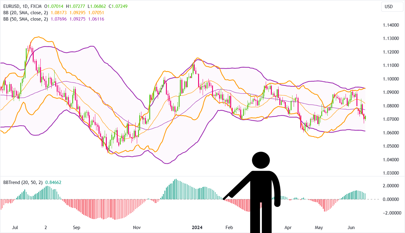
Here’s an example showing a daily chart of EUR/USD with Bollinger Bands applied:
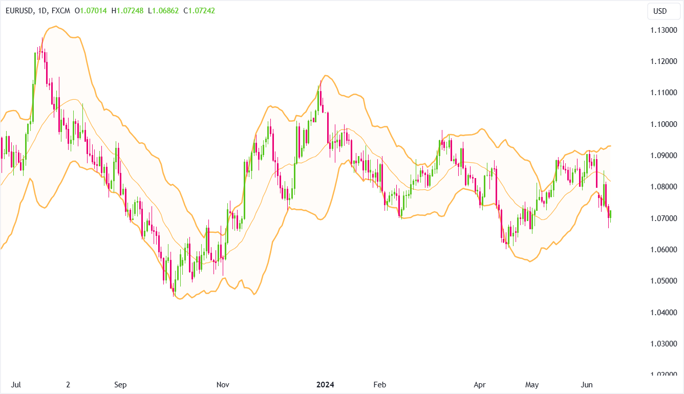
When prices approach the upper band, it signals overbought conditions, while a dip toward the lower band suggests oversold conditions.
If you’re not familiar with Bollinger Bands, be sure to check our separate lesson on Bollinger Bands!
Introducing BBTrend
What is BBTrend?
BBTrend takes traditional Bollinger Bands to the next level by providing a clearer view of market trends!
It looks at two separate sets of Bollinger Bands and displays the results in a histogram format that’s shown BELOW the price chart:
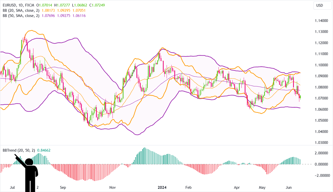
BBTrend originated from observing the behavior of traders slapping on multiple Bollinger Bands, specifically the 20-day and 50-day, on a single chart.
This common practice sparked an “Aha!” moment!
By sticking to the standard width of +/- two standard deviations, a pattern popped up:
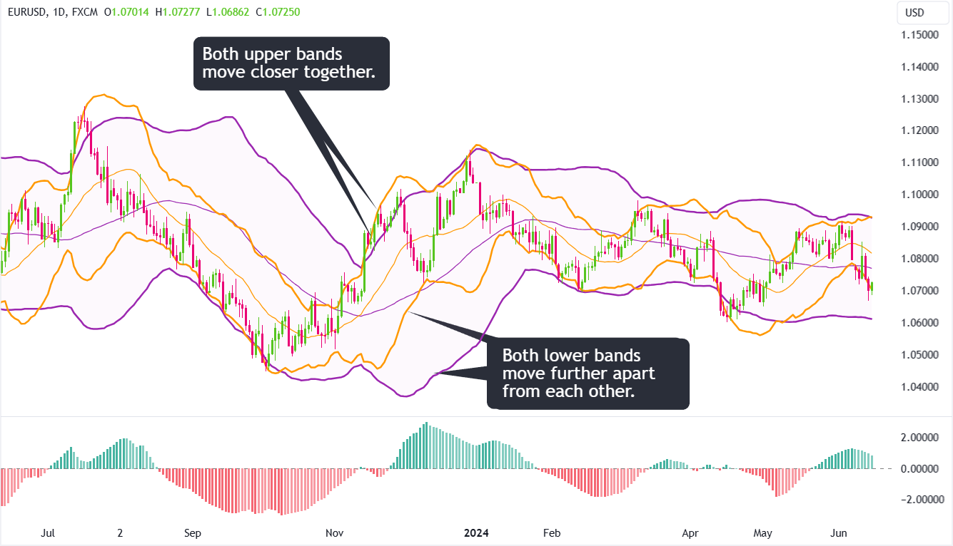
Uptrend
In an uptrend, the upper bands move closer together, while the lower bands spread apart.
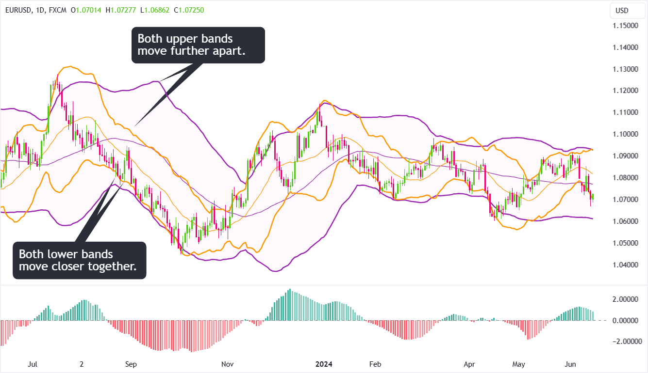
Downtrend
In a downtrend, it’s the opposite—the lower bands come closer together, and the upper bands spread apart.
This insight inspired the creation of BBTrend.
How BBTrend Works
BBTrend helps you see how the Bollinger Bands interact.
Here’s how it works:
- It calculates the absolute value of the difference between the lower bands and subtracts it from the absolute value of the difference between the upper bands, normalizing the result and showing a histogram.
- This math turns complicated market movements into a clear, easy-to-understand picture.
Histogram
BBTrend is displayed as a histogram oscillating around a zero line.
The interpretation is straightforward:
- Positive values: Indicate an uptrend. The higher the value, the stronger the trend.
- Negative values: Indicate a downtrend. The lower the value, the stronger the trend.
- Near zero: Indicates a lack of a clear trend or sideways movement.
Green Bars
Green bars appear when the difference between the upper bands is smaller than the difference between the lower bands.
- Light Green Bars: Indicates the current bar is greater than the previous one.
- Dark Green Bars: Indicates the current bar is less than the previous one.
Red Bars
Red bars appear when the difference between the lower bands is smaller than the difference between the upper bands.
- Light Red Bars: Indicates the current bar is less than the previous one.
- Dark Red Bars: Indicates the current bar is greater than the previous one.
Color Intensity
The color intensity of each bar in the histogram shows the direction of BBTrend:
- Brighter Green or Red: BBTrend is moving further from 0.
- Dimmer Green or Red: BBTrend is moving closer to 0, but still above it (for green bars) or below it (for red bars).
Changes in the color intensity of the bars (from light to dark) can signal shifts in momentum and potentially indicate a change in the trend direction.
How to Read the BBTrend Indicator
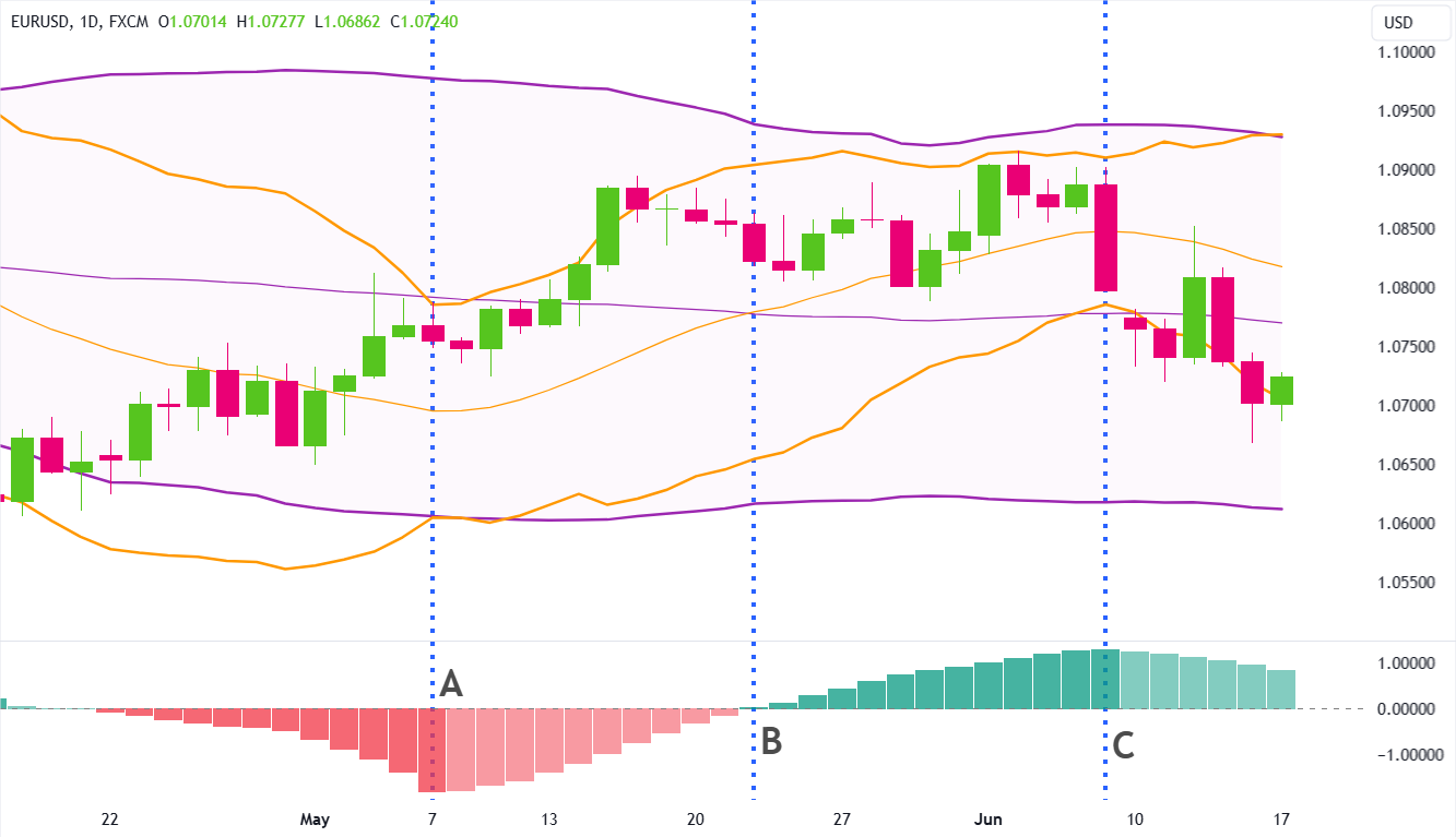
Let’s zoom in on the histogram to get a better look at the relationship between the two Bollinger Bands on the price chart:
To make this even clearer, let’s “dim” out the candlesticks so we can just focus on the Bollinger Bands themselves:
Since all BBTrend cares about are the upper and lower bands of each set of Bollinger Bands, let’s also hide the middle bands.
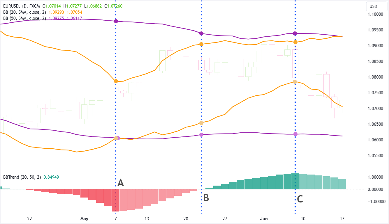
Point A:
- The distance between the lower bands is smaller than the distance between the upper bands. For example, notice how close the lower band of the faster BB (light orange dot) is to the lower band of the slower BB (light purple dot). Now, look at how far apart the upper bands are from each other. This is why the bar is red.
- The distance between the lower bands is smaller than the distance between the upper bands of the current bar is greater than the previous. This is why the bar is dark red.
Point B:
- The distance between the lower bands is similar to the distance between the upper bands.
- For example, notice the distance between the lower band of the faster BB (orange) and the lower band of the slower BB (purple). Now, look at how far apart the upper bands are from each other. The distances are about the same.
Point C:
- The distance between the lower bands is larger than the distance between the upper bands. For example, notice how far apart the lower band of the faster BB (light orange dot) is from the lower band of the slower BB (light purple dot). Now, look at how close the upper bands are to each other. This is why the bar is green.
- The distance between the upper bands is smaller than the distance between the lower bands of the current bar is greater than the previous. This is why the bar is dark green.
Now…let’s add back the candlesticks (but continue to hide the middle bands)…
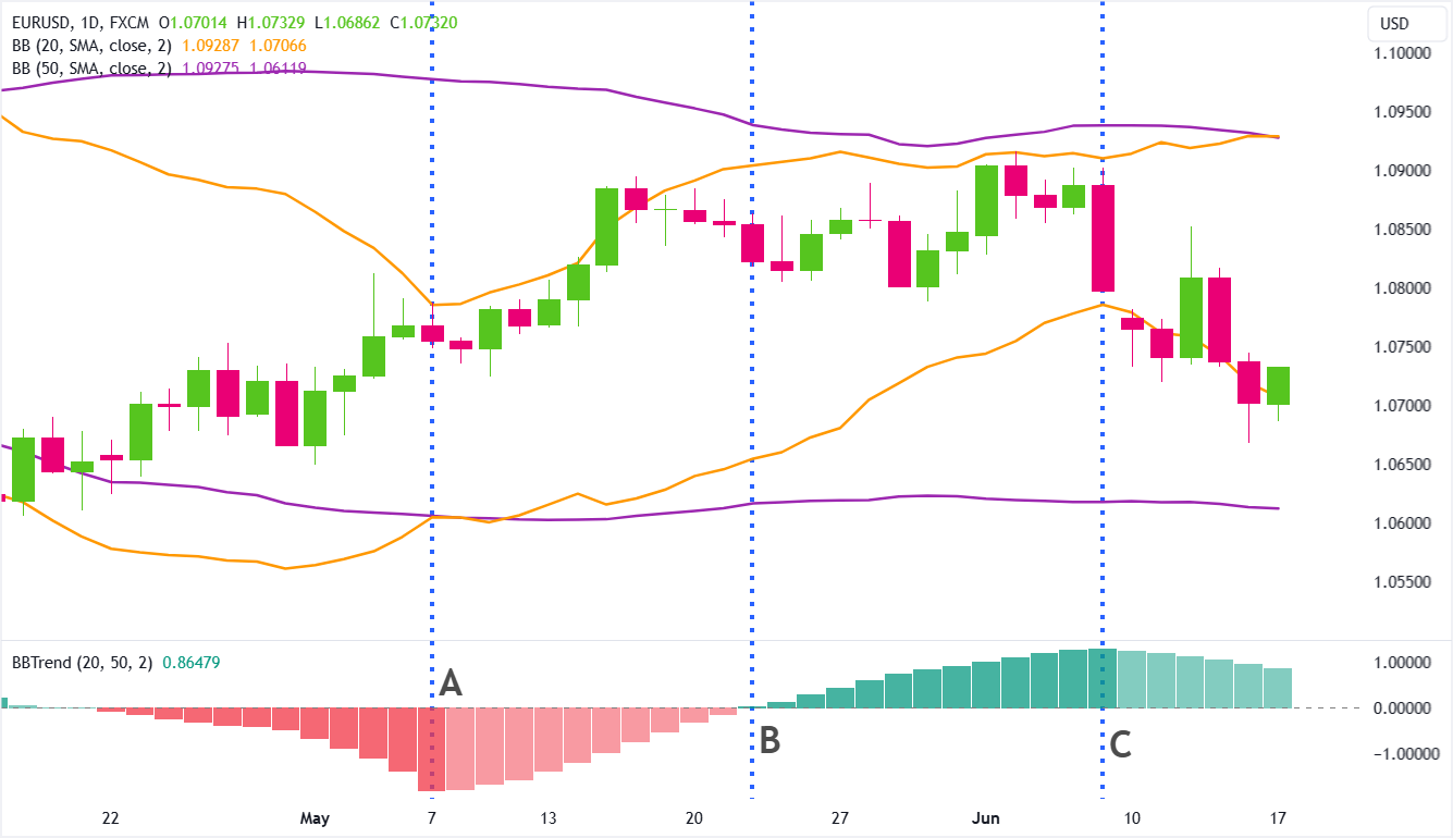
Hopefully, you should be able to better see how BBTrend works!
How to Use BBTrend in Your Trading Strategy
While BBTrend can be useful in assessing trend direction and strength, it is still a lagging indicator so there are times when it indicates a strong bullish or bearish trend, but that’s exactly when the trend is about to fizzle out or even reverse.
A better approach is to use the indicator to identify momentum shifts that can signal a trend reversal:
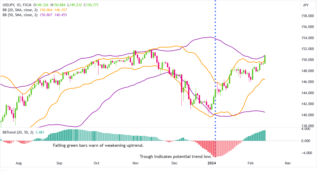
Identify Potential Trend Reversals
Pay close attention to the peaks and troughs of the histogram.
Peaks can signal potential trend highs, whereas troughs may indicate potential trend lows.
Observe Color Intensity
Note changes in the color intensity of the histogram bars, as these can indicate shifts in momentum.
More intense colors suggest increasing strength, while lighter colors indicate a weakening trend.
It’s like the market’s way of changing the brightness on your screen – pay attention to those changes!